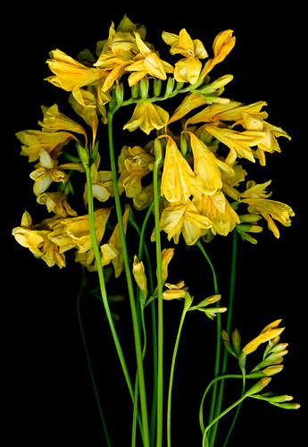
Dead Fresias
I was flicking through a magazine recently and saw a feature of the most beautiful images which had been made on a scanner. I stupidly didn't get the photographer's name and I've been Googling like mad today and haven't come up with him/her.
I thought I'd have a go at scanning some 3D stuff but of course it wasn't as simple as I'd expected and I certainly wasn't helped by the fact that the inside of the scanners glass is absolutely filthy so every image was splattered with dots, dashes, splodges and scratches. I'm pretty good at getting rid of superfluous stuff in Lightroom, but there was just so much that I had an experiment in Photoshop and found a fantastic Filter which did just what I wanted (so long as you don't look at the fine detail around some of the edges too closely!) I'm really pleased with the contrast and the quality of the black here. I thought that this technique could lead to a nice new line of prints but I'm rather mean with my more-expensive-than-oil ink so I thought that it might be a good idea to make the background white to eliminate the buckets of black ink that these images with a black background would use but my Photoshop skills just aren't up to the job. I messed around for a while with the Magic Brush Tool and Colour Replacement option but they were all useless and there was no way on earth that I was going to click my away around all this ribbon with a pen tool (not forgetting that I'd actually need to teach myself to use it first!). So I thought I'd try to make a white background at the time of the scan. Didn't work. I made a little structure with tins of tomatoes holding up an A4 light box which I thought had to work. It sort of worked, the background of the scan was certainly pale, but you could see the horizontal banding produced by the light box light (like you get if you photograph the TV screen). I tried to get rid of it in Photoshop, but again, my sad lack of skills let me down and I'm sorry to say that at this point I sulked and gave up.


I love how vivid the colors are against the black background. I really like the image with the ribbons.
ReplyDelete